Tag Archives: Interior Design

Current Project: Titan Flow Corporate Office

Rob recently, completed a serene office environment designed for an executive, combining modern lines with richly textured surfaces.

Design Lines Commercial Interior Design Office Lumberton5

The guest chairs (above) are upholstered in a luxurious cut geometric velvet.

Design Lines Commercial Interior Design Office Lumberton


Design Lines Commercial Interior Design Office Lumberton3

Quartz leger stone on the back wall gives a rough texture, casting subtle shadows that give the room dimension.

Design Lines Commercial Interior Design Office Lumberton4

Perforated metal on the desk and industrial-chic exposed steel beams add to the urban feel of the space.

Design Lines Commercial Interior Design Office Lumberton2


How to Accessorize Bookshelves (A Lesson From the Chancellor’s House)

A large empty bookcase can be intimidating.  What combination of books and objects should you use to make it look its best?  The Chancellor’s house at NCState is a great case study in how to make your shelves look amazing.


In the Chancellor’s Study, we used a combination of books, small framed artwork, and decorative objects to create a sophisticated display worthy of a distinguished university.  The photographs of native plant species were taken from the University’s archive, and reference the Chancellor’s own background in botanical science.


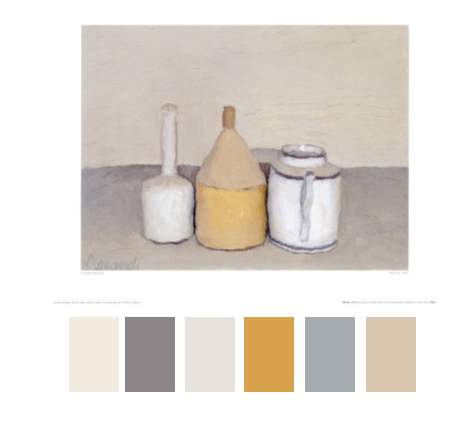
Books in warm tans and browns were chosen to complement the masculine palette of the room.  We tried to make the bookcase look natural and organic, but without totally eschewing symmetry.  We also placed books in other places around the room for continuity and interest.


In the family room, we were looking for something more graphic, so we chose a different palette.  Bright red books and colorful glass art punctuate the white bookshelves.  In this room, the shelves are arranged in square cubbies, which are great for displaying individual works of art.


We took a different approach to the books in this room, stacking them both vertically and horizontally to add some interest.  In some cases, we even turned the books around, hiding their binding at the back, and giving a whole different look.


What’s your favorite trick for arranging bookcases?

-Robert

Images: 1 3 & 6. DLL    2 , 4 & 5 –  Photography by Dustin Peck Photography Images courtesy NC State University. All rights reserved.


A Closer Look: Historic Inspiration from the Met

One of my favorite places to look for inspiration is the collection of the Metropolitan Museum in New York.  They have much of their collection online, including everything from modern photographs to historic drawings.  I like to browse the historic drawings to inspire my own projects.  Take a look:

Design for Painted Ceiling Decoration

Design for a Room in the Etruscan or Pompeian style (Elevation)

Architectural Drawing for a Chapel

Framed Design for an Architectural Interior: Coffered Ceiling with Central Hexagonal Cartouche and Walls with Floral Ornament and Drapery.

Design for a Ceiling in Pompeian Style


Get some inspiration of your own at the Met Website.

– Robert


A Closer Look: John Chamberlain

John Chamberlin (1927-2011) is a great example of an artist who made a career out of exploring one material.  For him, that material was crushed car parts.

His sculptures are surprisingly delicate  & elegant considering their source.  I am always amazed at how Chamberlain was always able to find new colors, shapes, and configurations to explore.

Some belive Chamerlian’s use of metal is akin to translating Abstract Expressionist brushstrokes into three dimensions.  Others simply see beautiful compositions.  Whatever the source, these are some of my favorite sculptures to look at.  I hope you enjoy them too.


-Robert

image 1: blogspot

image 2: daily art fixx

image 3: whitehot

A Closer Look: My Favorite Painting in North Carolina

There are a lot of paintings in North Carolina.  But of all the ones I’ve seen, my favorite is Berkeley No.8 by Richard Diebenkorn.  Part of the North Carolina Museum of Art’s permanent collection, this painting is an iconic example of Diebenkorn’s signature style, in which he used landscapes to inspire abstract compositions.  The subleties of color and delicate application of paint make this painting interesting and beautiful.  It always holds my gaze for a long while…

Berkeley No. 8 is hanging right now in the modern galleries of the North Carolina Museum of Art, so go see it soon!

-Robert

image: NCMA

A Closer Look: Louise Nevelson

Louise Nevelson is one of my favorite artists.  A master of found object sculpture, she was known for her room-sized wall pieces made of wood & painted in monotone.  Almost all her work is flat black, but she also created work in gold, white, and green.


By working in monotone, Nevelson was able to emphasize the formal qualities of her objects, elevating scraps of wood to beautiful compositions.   She was a master at joining together disparate forms to create a sense of balance and mystery.


Many people acknowledge a connection between Nevelson’s work and the Abstract Expressionist movement of the 1940s-1950s.  This movement emphasized grand themes like masculinity, the subconcious, and the sublime, and included painters like Jackson Pollack and Franz Kline.

In addition to working in wood, Nevelson also created a large number of outdoor steel sculptures.  These works maintain the vitality of her more intimate works, but on a grand scale.  They can be seen in many public places across the country, inluding a plaza named after her in New York’s financial district.

Louise Nevelson’s unique style continues to influence artists and designers up to the present day.  Take a closer look and see what you discover.

-Robert

image 1: sfmoma

image 2: art ideas

image 3: dna info

image 4: mutual art

A Closer Look: Giorgio Morandi

What better place to look for color inspiration than a master Painter?  And who better than Giorgio Morandi (1890-1964), an Italian painter who specialized in still life?

After 1922 he developed the signature style he would become known for, focusing on subtle gradations of hue, tone, and objects arranged in a unifying atmospheric haze.

His beautiful paintings, though created decades ago, are surprisingly fresh. In fact, Morandi’s color palettes seem surprisingly contemporary.

Take a look: they might be the perfect inspiration for your next design project.  Can you imagine a room painted in these gorgeous tones?

-Robert


image 1 & 2: Art News

image3 & 4: Heidi Haseltine Photography

Award Winning Interior Design | Raleigh, NC