I adore OLY Studio.
 This postcard from OLY Studio came in the mail today with the rest of the High Point Fall Furniture Market teasers. They are really piling in now, we keep them in a beautiful porcelain container on the transaction counter near Laurie’s desk and peek at them during lunch (see photo below) The styling of the postcard caught my eye, but let’s be honest, so does anything from OLY. Their collections are eclectic & clean, with some pieces looking very Hollywood Regency and others looking rustic and earthy with hand hewn qualities.
The pieces below will be at our first ever sale- The Pear Square Event the first week in November. (You can call the studio if you’re interested in them, now though)
The Christine Cocktail Table would look so great with piles of big books underneath it.

A pair of Bella sonces could break up a photo arrangement in a gallery hallway.

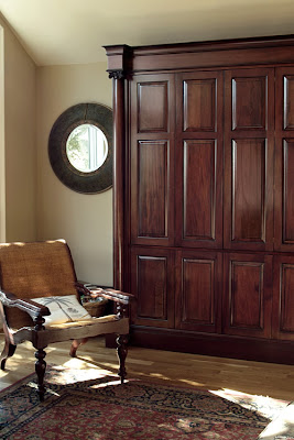
This,albeit, huge, is the. perfect. mirror.
 I would hang it on a wall in my bedroom & tape just a few b & w photos on it a la The Diving Bell & The Butterfly (which I also love) to make it a little less stuffy.
ASID Carolina’s Chapter- President’s Brunch 2008
Newest Addition to DLL
Hilaire & I loaded the DLL van this morning to prepare for a huge drapery & bedding installation we have tomorrow at the Lake.
Here we’re showing off our lovely Design Lines aprons….
94 books from local library book sale
Over 50 Pillows (Which translates into countless feathers)
48 Drapery Panels
24 Drapery Rods-Wood & Iron
10 Duvet Covers
3 Side Tables
& a Wooden Horse
Nursery: It’s a boy!
 We received the most beautiful birth announcement from our clients, Sam & Kristen Lampuri this week! (Photo by Jaime Lackey Photography)
The knobs, from Anthropologie, personalize the otherwise simple & classic dresser. My favorite element of the room is the Cream & Jet Black Geometric Carpet, it uplifts the space so much, like the feeling you get walking into a candy store.
I love this photo of proud Mama Kristen in a casual glider chair from Serena & Lily. Molly calls it the “calm before the storm” photo. After “surviving” our tropical storm Hannah this weekend, and after meeting little Mason I can say that he could be the most perfect, good-tempered, & adorable storm you ever met.
One More Nursery for the Portfolio…..
There must be something in the water around here, because Design Lines has been on a roll designing nurseries. They are so much fun and each one takes on its own character.
Olympics Inspiration
There’s a bit of sadness at Design Lines today. Perhaps its because the 17 day party of the Olympics is now gone and we’ll have to wait another 4 years to be OBSESSED with the games.
All of us found it hard to get some sleep the last two weeks but we couldn’t help but stay up way past the decent hours of the night to catch a glimpse of the awesome moments. Some of the DLL highlights include:
The sensational Opening Ceremonies
Amazing Gymnastics (who else adores Bela Karolyi?)
Michael Phelps (of course)
Discovering new Olympic sports (Trampolining, anyone?)
Beach Volleyball
The list goes on….
I think it’s safe to agree that the USA represented plenty of Gold, Silver, & Bronze. Perhaps we should consider Swiss architecture firm Herzog & de Meuron for a Gold medal in design for the beautiful architecture that is the center of the Olympics: The Birds Nest. Read more about it here:


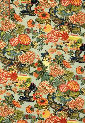
Tragic that the Olympics are over, but at least we can all drown our sorrows in these gorgeously Asian-inspired fabrics from F. Schumacher & Co:
Shiroko Silk Velvet in Bronze
Chinois Fret in Cinnabar / Gold

Design Lines Field Trip: Columbia, South Carolina


 We also visited the lovely Dupree building downtown and Ellen Taylor was gracious enough to show us around her interior design studio. The most interesting part of the day was touring M. Craig & Company’s expansive millwork shop. Seeing the multiple processes that each cabinet goes through including the impressive & precise CNC machines. The finished product is truly beautiful.
We topped off our day with lunch at the delightful Southern Palmetto Club. I recommend their cranberry orange bread.
A fitting summary of the trip comes from Rosie in a 2004 article from the South Carolina Business Journal: “I believe, by seeing in practice, the whole world wants a piece of the South,” Rosie said. “They want to be part of that romantic element and that romantic dream. The fact that our products are made here satiates that yearning to have a piece of the South.”
As an Illinois expatriate, I’d second Rosie’s insightful statement. Who wouldn’t want an M. Craig & Company piece in their home? A true piece of the South. Our Columbia tour was another lesson in beautiful workmanship, an opportunity to learn about a new product resource, and a field trip we at Design Lines won’t forget.

New Favorite!

I especially love the pick your own berries from Creedmoore’s Lyon’s Farm.


My Top 4 Reasons to love Bradley-Hughes:

1– The Lily Chairs, pretty as a picture by themselves (although I think they are stronger as a pair). Judy used a pair of the Lily chairs in the ASID Showhouse
2– The Marie ottomans. I can’t wait to put these in a client’s guest bedroom at the end of the bed. Never before has an ottoman looked so welcoming to me. 3- H. Pierce Wallcoverings, exuding warm, lived-in texture. I recently specified this product in the Ginger Root Colorway for a wallcovering in a metropolitan master suite.
 4- Someday, I’ll own the Lucille Hand Forged Iron Chandelier for myself. Beauty!
 Hey Design Lines Ladies, what are your favorite things?


