Category Archives: Current Projects

A Powder Room Transformation

Even though a powder room seems small, it can take longer to transform than a master bathroom. Don’t ever let size fool you. The smaller the room, sometimes the longer it can take.

This powder room was an amazing transformation. We started with the builders basic pedestal sink, white walls, and standard vanity lights. We were ready to move forward……..

This is the beginning of the project. We did have the existing hardwoods working for us, so we did not have to mess with that portion of the project.


Here is the after……..
These few additions transformed this powder room from standard basic, to elegant and fabulous.
Rule #1: Remove the vanity light and replace it with a decorative chandelier. You can really step outside the box because it becomes a focal point. This particular chandelier is from Currey and Company.
Rule #2: Always add a decorative mirror above the vanity. The client found this one from Horchow. What an amazing difference.
Rule #3: Go sophisticated on the vanity. You can get a vanity that is your style, contemporary, transitional, traditional, or modern, but spend a little more on it. It becomes the glue to the room. This amazing vanity is from Ambella Home, and literally took three months to get.

Rule #4: Your faucet, toilet paper holder, towel bars or rings, any plumbing features or accessories, are basically the jewelry to the room. This Sigma Faucet came wrapped in a box like you would see a diamond ring pulled from. These pieces are important and spend time picking them out. They can make or break a room.

Rule #5: Always add one more element that the person next door would not ever think of. In this powder room the client and I decided to pull out the gold shimmer from the wallpaper and paint the ceiling. This really created an extra touch of elegance that the room needed. Without it, a ceiling painted white, would be a huge eye sore.

Rule #6: The last rule and one of the most powerful rule of all powder rooms. WALLPAPER. Ok, so I know what you are thinking, but wallpaper has come a long way. You would be surprised what is out there. It really made a difference in this powder room. It was a building block from the beginning. This great wallpaper came from Stroheim.

Another transformation with an amazing ending!

“This Olde Farmhouse”

So a previous client of Design Lines bought land near Lake Wheeler. On this piece of property was this beautiful old farmhouse. This land use to be used for old tobacco fields and farming, so there is history that goes back to the 1800’s.

They are renovating this to create a farmhouse that will be used for a guest house. The house is neighboring their house, so a cobblestone pathway will separate the two.

All of the previous hardwoods, siding, basically anything that can be reused will be put back into the house. The contractor is even using some of the old wood to build the custom cabinetry for the kitchen.

While in this process you can imagine the great finds that they came across. A set of receipts were found from the tobacco bails that were sold. They even found mail from the 1950’s. All of these finds and more will be preserved and put back in the house for character.

…………….. So I am beginning this series to show you the wonderful changes that will occur and hopefully completed at the end of the year. I also am finding some wonderful resources that I have to share, because they are too good to keep to myself!

As you can see the house is getting a face lift and a stability check! First they have to reinforce the house, because it was still standing on the old stones that it was the first time it was built. They don’t build foundations the same way as they did in the 1800’s.

The roof is going to remain the same style, but a newer product will be used that will last many more years. We have decided that a brick red metal roof will be perfect.

Well that is it for now. Soon you will see phases of the farmhouse being completed and I look forward to sharing all of the great concepts and products that we find. To be continued……….

A Master Bathroom Transformed to Elegant and Classic

Everyone deserves a master bathroom that is classic, timeless, and a retreat away from reality. This master bathroom renovation accomplished all of that and more.

(The existing yellow walls were far from comfortable and cozy. The owner was excited for a new color scheme.)

(The room has a “L” shaped feel, so keeping everything light and larger scale was going to be the direction. By adding an 18″ x 18″ tile on the floor it really took away from the “L” shaped direction.)

(With the large marble tile turned at an angle, this bathroom visually became larger. Also the large scale wallpaper from Schumacher, created the same scale and feel throughout the room. The decorative semi-flush light was a great scale for the room and added a classic touch of elegance.)

(Using the frameless approach with the glass, we kept the room feeling open. The same marble was used in the shower but a smaller scale to keep uniformity throughout the bathroom. A decorative neutral accent tile was added for a touch of added sophistication and elegance.)

(A large mirror was the way to go above the cabinet which kept the continuous feeling on that wall. Pulling the sconces through the mirror made them feel as if they were floating on the wall.)

The master bathroom was a huge success! The owner can now enjoy a classic and elegant master bathroom that is fitting with he rest of her decor throughout.

My Favorite Photos from a Recent Installation

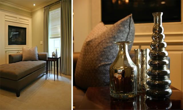
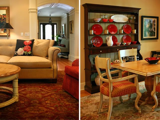
Here is a sneak peak at a work in progress nearing completion. I was able to create a totally new look for these clients by changing the fabrics on some of their existing pieces and adding in some new pieces along the way. The result is something new, fresh and different than what they had previously.


The new master bedroom chaise, nest of tables and mercury glass accessories create an inviting spot to read by the fireplace.


I worked closely with the Atlanta showroom Ainsworth-Noah, the east coast representative for New Classic Creations who master-crafted the master bed to our specifications.


The open family room, kitchen and breakfast room are the heart of the home. The new hutch was a perfect compliment to their breakfast table and chairs, and the new upholstry in the family room worked perfectly with their rug.


By adding window treatments and an accent bolster for the bed, the guest bedroom takes on a whole new personality.


The custom foot thows made from a Ralph Lauren woven fabric trimmed in a Lee Jofa cut velvet are my favorite addition to this secondary guest bedroom. My insiration came from the new Romo fabric at the windows.

Inside the Beltline Remodel

I couldn’t resist sharing this gorgeous detail from a remodel project I’m working on:

This image comes from the front stoop of the home- an early 40s gem of a house located in Raleigh that possesses so much personality and potential. The owner and contractor, Robert Taylor of Taylor Build Construction, has already expanded the attic to reveal a second story living area. Together with his wife, Elizabeth, we’re currently working on the selections for the kitchen, bathroom, and the refinishing of the hardwood floors.

Our inspirations: a color palette that includes apricot, paprika, and black & cream, Peter Dunham Textiles, & their pug Daisy.

Recent Projects: Haley’s Room

Back in November, one of our clients came to us, wanting to complete a space for her daughter’s 13th birthday. Haley- a dancer, horse lover, and vibrant teenager wanted a space that could serve many purposes.
(Above: Haley in her old space)
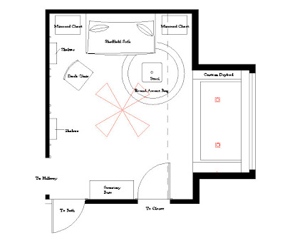
Rather than placing a large queen size bed in the space- we opted for a custom daybed with trundle underneath- perfectly sized for a window niche. We designed the rest of the space to accomodate studying, relaxing, dancing, and gathering with her sisters and girlfriends.
Haley knew exactly what she wanted:
polka dots
ribbons
femininity
and a space for everything- including room to dance
The floor plan, below:

From there Judy and I determined a color palette of turquoise & fuschia- some of Haley’s favorite colors, but a departure from the seen-before pink and green. The name of the paint color on the bathroom walls and inside the wall panels is ICI:Frankly Scarletthe perfect hot pink hue.

We designed a paneled wall (above); installing trim moulding and using contrast paint to highlight Haley’s collection of trophies– displayed on mod acrylic shelves. The central panel is a custom memory board created from fuschia linen and multi-colored grosgrain ribbons. She can post photos and notes on her wall.

The seating area consists of a settee perfect for a young lady flanked by two mirrored chests evoking the mood of a dance studio. A chair from Stanley’s Coastal Living collection can pull up to the secretary where Haley does her homework and an upholstered stool can serve as seating at sleepovers, an ottoman, or a place for magazines and books. My favorite accessory is the pair of large yellow gourd lamps.


Check out our album slideshow of Haley’s Room, before & after (special thanks to Haley & her mom for letting us blog about their space)

Call Design Lines if you’re interested in creating a bedroom for your son or daughter-

Current Project: Groundbreaking at the N.C. State University Club


Design Lines was present yesterday as N.C. State Chancellor James L. Oblinger and N.C. State University Club Board of Directors broke ground at the N.C. State University Club on Hillsborough Street at the 440 beltline.

This project started in 2004 with a vision from the long range planning committee to update and renovate the club.

After 5 years of planning and design the project is underway. The most notable change will be the front façade and the interior finishes. This will be a fun one to watch as the transformation takes place.

“The N.C. State University Club was dedicated in 1965 and serves N.C. State supporters, including faculty, staff and alumni ” NC State University Club.

Design Lines is part of the design team working with Winstead and Wilkinson Architects on the project. Click here to see a past post on the N.C. State University Club.

Orange you glad I posted this paint color transformation?

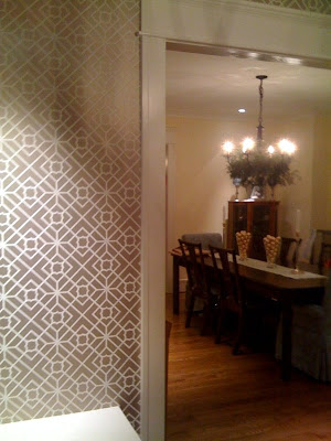
Our clients & friends, the Cummings family, recently painted their dining room a delectable orange color from Benjamin Moore after the installation of some lovely wallpaper we specified from Schumacher. I thought I’d share some before & after photos of the exciting process.

Before

After-Voila!

For those of you last minute shoppers out there- consider a paint consultation from Design Lines as a gift for your loved one. A paint color can change your space dramatically & breathe new life for the New Year into your home or office.

Please comment on this post…I’m anxious to hear your thoughts on their
beautifully transformed space. Simply click on the blog’s title or the pencil
below & post comments.

P.S Special thanks to the Cummings
for allowing me to post these images, I especially adore the wreath hanging in
the chandelier above the table.

Nursery: It’s a boy!

We received the most beautiful birth announcement from our clients, Sam & Kristen Lampuri this week! (Photo by Jaime Lackey Photography)
Judy & I completed their nursery design for little Mason about two months ago now, & I’ve been so anxious to finally post these pictures that I took the day before Kristen was due in July.

The Crib is a “Built to Grow” Crib from Stanley Furniture. We love its capability to transform into a “big boy” bed and the deep espresso wood finish.
The wall letters were painted in custom colors by Going-Ga-ga!

The accessorization was just about complete that day. I adore the cheery hue of this cubbie case from Maine Cottage. The artwork, inspired by Dad’s occupation, was selected by Sam & Kristen & is from Rosenberry Rooms. On another wall, we hung black & white family photos in frames from plumbing valve handles. When painted orange, they transformed into a fun graphic element.

The knobs, from Anthropologie, personalize the otherwise simple & classic dresser. My favorite element of the room is the Cream & Jet Black Geometric Carpet, it uplifts the space so much, like the feeling you get walking into a candy store.

I love this photo of proud Mama Kristen in a casual glider chair from Serena & Lily. Molly calls it the “calm before the storm” photo. After “surviving” our tropical storm Hannah this weekend, and after meeting little Mason I can say that he could be the most perfect, good-tempered, & adorable storm you ever met.

One More Nursery for the Portfolio…..

There must be something in the water around here, because Design Lines has been on a roll designing nurseries. They are so much fun and each one takes on its own character.

Recently, my clients, Scott and Nicole Gass, told me that they were expecting twins in September. How exciting! It was even more challenging because they were having a boy and a girl. This was exciting because the room would not take on the typical boy/girl theme.
The best find ever, that got me going in a direction, were these hand-painted frogs. I found them at a local store — Dilly Dally. Dilly Dally has stores in Raleigh and Charlotte, NC. Check out their website!
After seeing them on the wall, I knew they were meant to be. One was a princess and one was a prince. What a great way to break up a wall that will house two cribs!
(Here is our handsome Prince frog!)
(Here is our beautiful Princess frog!)
After we got the gender-neutral design direction down, it was on to the bedding. We accented the walls and hand painted frogs with a bedding that was a mixture of stripes and a large scale damask- a great mix of patterns as it allowed the design to stay appropriate & not too feminine or masculine.
With a few more touches that are shown in the pictures below, the nursery came out perfect.
This picture show the proud parents of Aidan and Verena. Adding their names above their cribs helps personalize the space. It also breaks up the wall that has two cribs.
I love adding color to rooms in unique ways. There was not a lot of storage, so we added shelves above the changing table to create more storage. We painted a decorative rectangle on the wall to bring the traditional pink and blue colors back into the room. This allows the shelves to jump out from the wall too.
I love this nursery, and the room feels spacious and inviting. I can’t wait to meet the lucky babies that get to grow up in this room.
So you see, decorating can start at an early age, at least we believe it should!